

Black and white is a color scheme that has always held some measure of popularity but has gained traction in recent years.
While once used to create quirky retro looks, it has been transformed into a key color combination in many modern spaces.
There are many ways to incorporate black-and-white color schemes into your space through a mix of interior walls and furniture paint.
Below, I have put together a list of the best white and black paint shades offered by Sherwin Williams for your consideration so that you can find the perfect ones for your dream space in no time.
But before you plan further, let’s first determine which shades of both are right for you. Also, which one to use, where, and when.
White vs. Black Paint Colors
Shades of white paint can give rooms an airy, bright feel. A cooler white will make spaces feel bigger, while a warmer one will create a cozier feel.
Though it tends to lean toward cooler tones or warmer tones, sometimes, you will find a white that is truly neutral.
Whatever you’re going for, whether cool, warm, or neutral, you may be struggling to figure out which white is best for you.
This can also be said about black. While some believe that black is only one exact shade or a type of color and nothing else, there is quite a variety. Certain black paints are navy-black or charcoal gray, while others have a warmer brownish tone.
If you’re looking to add Sherwin Williams black paint to trims, shutters, interiors, or front doors, narrowing down the different options in these subtle shades of black can feel difficult.
However, with this article, you can figure out which Sherwin Williams paints go best together in your specific project to leave you with a finished product you are satisfied with.

Top White Colors by Sherwin Williams
Sherwin-Williams offers a wide variety of whites to suit any space.
From cool, neutrals to warmer shades, there’s a white for every taste. Here are some of my favorites…
1- Alabaster, SW 7008
(R: 237 G: 234 B: 224 LRV: 82)
Alabaster is one of the most popular shades of white by Sherwin-Williams which is quite neutral and sometimes referred to as off-white. The shade is particularly known for its warmer appearance due to its yellow undertones.
Suitable for both interior and exterior applications, this creamy hue adds a touch of warmth and elegance to any space. It’s a great option for those seeking a white shade that won’t appear too stark, even in bright light.
You can use SW Alabaster for walls and ceilings, along with trims in a room. It also feels awesome when paired with other colors like dusty blue, slate, and green.
If you are using it on trims, make sure you use a darker shade for walls to maintain its beauty.
2- White Flour, SW 7102
(R: 244 G: 239 B: 229 LRV: 87)
With this color of paint, you can expect a warm white shade with a twist. Unlike Alabaster, at the foundation of the White Flour paint color, there are creamish-yellow undertones that make it stand out.
While it may not be as apparent, Alabaster can sometimes exhibit a subtle yellowish hue, which is not typically observed in White Flour.
All in all, Sherwin Williams White Flour is a delightful and ethereal creamy off-white neutral that leans towards the warmer side of the spectrum.
The harmonious combination of the grayish-brown colored sofa and gold accents beautifully complements the elegance of White Flour in your room.
3- Pure White, SW 7005
(R: 237 G: 236 B: 230 LRV: 84)
Much like its name suggests, Pure White is just that. This is the color of white for anyone who wants a white that is totally neutral. It’s neither overly cool nor warm and therefore looks great in any room.
When considering Sherwin-Williams Pure White as a paint color, its brightness can vary depending on the lighting and surrounding finishes.
Although not too bright, it’s a great choice for crisp trim and ceiling colors in interior spaces. For walls, it works best as a crisp off-white when the room is filled with warm light and balanced with warm finishes.
4- Spare White, SW 6203
(R: 228 G: 228 B: 221 LRV: 77)
With its cool tones and super light gray undertones, Spare White is a fairly neutral white. I think it’s the touch of these gray undertones that really sets Spare White apart from Sherwin-Williams Pure White.
It looks great in bedrooms or in spaces that need a slightly cozier appearance. You can combine it with a similar off-white for accents and trim.
Also, pops of green can bring out its beauty further while sticking with browns or grays will help keep the look muted and natural.
5- Dover White, SW 6385
(R: 240 G: 234 B: 220 LRV: 83)
Lovers of creamy white hues will enjoy Dover White. This smooth color goes well with so many colors (like red, blue, green, yellow, plum, purple, etc) and is particularly popular for use in kitchens, especially on cabinets.
However, please be aware that Dover White has a creamy yellow undertone which may become more prominent when paired with cool tones or specific greige paint colors in spaces like living and bedrooms.
A great tip for anyone considering this shade of white is to use it in combination with other shades like Ultra White or Snowbound for a contemporary look.
This will keep the color from appearing too yellow in certain lighting conditions.
6- Snowbound, SW 7004
(R: 237 G: 234 B: 229 LRV: 83)
The name Snowbound gives you a good idea of what it will look like. This is a cool white color that has hints of some greige, making it on the warmer side.
Snowbound is considered a versatile soft-white shade that reflects just the right amount of light to give exteriors a true white feel, while still offering a touch of warmth to keep it from feeling too stark.
You can pair it well with various gray-influenced shades such as Mega Greige, Accessible Beige, or Agreeable Gray, and can be a good choice for trim and cabinetry.
7- Eider White, SW 7014
(R: 226 G: 222 B: 216 LRV: 73)
Elder White is a nice choice for anyone who wants something a little darker than typical white. Its hint of gray gives it a grayish-pink color depending on the light in the room at any given time.
Eider White does fall on the warm side which sometimes looks pink. I know you might be thinking – why pink?
When painting a room with south-facing windows and abundant light, Eider White can appear as a lovely light greige color. But north-facing rooms or darker spaces with limited light will accentuate the paint’s pink/purple undertones.
For a timeless and clean palette, consider pairing Eider White with black and white. If you’re a fan of the modern farmhouse aesthetic, combining Eider
White with taupe will also create a winning combination in your space. Additionally, you can experiment with darker neutrals or even bolder colors to create different looks.
8- Aesthetic White, SW 7035
(R: 227 G: 221 B: 211 LRV: 73)
SW Aesthetic White color tends to look off-white on walls and is a good choice for any room with white trim. It has a small touch of gray and a hint of warmth that makes it a comforting color, it looks especially nice in the bedrooms.
Aesthetic White also comes with a subtle violet and pink undertone but compared to Eider White it has weaker pink undertones which gives it a peaceful dove-like calmness ideal for minimalist living spaces.
In my opinion, SW Aesthetic White is like the perfect dance partner, gracefully complementing sky blues, lemon yellow, lighter browns, teals, and grays.
You can even create that stylish symphony by flaunting it with metallic accents like matte black, bronze, brushed brass, and even the glimmer of chrome or nickel in spaces like kitchens, living, and dining rooms.
9- Marshmallow, SW 7001
(R: 238 G: 233 B: 224 LRV: 82)
Marshmallow white is a warmish white hue that has a slightly red tone. Its dash of red also means it gives off a pinkish-white hue in some types of lighting.
This paint color is like a sunbeam in a can – It reflects light like no other, making your space feel lighter and brighter. If you’re in an apartment or a small builder home, trust me, this is the paint color you need.
However, Marshmallow is not your typical white shade that can be universally applied. It possesses inherent limitations that are influenced by its undertones and lighting circumstances.
For instance, if your design target is young girls, like in kids’ bedrooms and play areas with ample natural light, Marshmallow unquestionably deserves a prominent spot on your palette.
But for any other space, or if you’re looking to achieve a classic look, it would be ideal to pair Marshmallow with lighter whites and grays.
10- Pearly White, SW 7009
(R: 232 G: 227 B: 217 LRV: 77)
Pearly White is a creamy white hue with a solid look that stands especially beautifully with wood furniture, no matter what type of wood you have.
In terms of undertones, Pearly White is a muted warm white and creamy color with soft gray and green undertones with no yellow overtones.
It’s often confused with Oyster White but, in the real-world Pearly White will be much brighter and lighter because of its much higher LRV.
While Pearly White is commonly chosen as a wall color instead of cream, its versatility and elegance make it a popular choice for any space. You can pair it beautifully with warm gray paint colors that share similar undertones. It also complements off-whites, greens, and purples.

Top Black Colors by Sherwin Williams
Besides beautiful whites, Sherwin-Williams has many different blacks to choose from, each with its own unique tone and mood.
Whether you’re going for a sleek, modern look or a more traditional feel, there’s sure to be a black that’s perfect for your project.
So, without keeping you waiting, let’s start browsing through our selection of top black shades today.
1- Iron Ore, SW 7069
(R: 67 G: 67 B: 65 LRV: 6)
Iron Ore is a very popular dark gray hue that is likened to that of charcoal. It is thought to be a lighter shade of black than some of Sherwin Williams’ other black paints like Caviar, Black Magic, and Tricorn Black.
However, SW’s Peppercorn is a suitable alternative if you think Iron Ore is too dark.
Sher Williams Iron Ore is a versatile color that can range from softer milky black to darker warm charcoal depending on lighting conditions. The visibility of undertones is heavily influenced by surrounding light.
So, in bright light, it may appear as a greyish hue with blue, navy, or green undertones in certain settings.
This paint color by Sherwin-Williams is most commonly used on doors, but you will also see it on accent walls, furniture, and even exterior spaces in many modern homes.
2- Black Fox, SW 7020
(R: 79 G: 72 B: 66 LRV: 7)
Black Fox finds itself on a different swatch than many other black paints by Sherwin Williams. It instead sits with Mindful Gray, Repose Gray, and Dorian Gray and has a rich chocolatey color blended in with the black.
I think Black Fox exhibits deep brown undertones, so pronounced that it is often characterized as a harmonious fusion of gray and brown hues that looks great on entryway doors, trim, and garage doors.
3- Tricorn Black, SW 6258
(R: 47 G: 47 B: 48 LRV: 3)
Tricorn Black is a part of the neutral paint family and shows itself as a darker shade of black than Black Fox and Iron Ore.
This is a true black hue that has no obvious undertones, making it especially good for use on black shutters. It is also a good choice for furniture, window trim, exterior doors, and statement walls.
However keep in mind that if you desire to have a softer black shade, Tricorn Black could be too dark for you. Also, because of its lower LRV, it tends to fade faster if used on surfaces exposed to direct sunlight compared to higher LRV shades.
If you have a front door facing southwest in a southern US climate and want to minimize the need for frequent repainting, this is definitely something worth considering.
4- Black Magic, SW 6991
(R: 50 G: 49 B: 50 LRV: 3)
Black Magic has a similar LRV score as Caviar and Tricorn Black, meaning that it, too, is a true dark black. Also, it has a tiny bit more red to it than Tricorn Black, which in turn makes it feel a little warmer.
With a warm black undertone, this shade is the ultimate wingman for accent walls, trims, bricks, and even kitchen and bathroom cabinets. Team it up with white for a clean look or add a pop of color to let it steal the show. It’s like having your own little design magician.
Just use good lighting in the room which will help bring out the beauty of this color.
5- Caviar, SW 6990
(R: 49 G: 48 B: 49 LRV:3)
As elegant and rich as its name suggests, SW’s Caviar is a warm inky dark black that falls into the neutral paint family as well.
With LRV of 3, Caviar and Black Magic differ due to undertones. While the former is true black, the latter possesses deep red undertones. It is also a bit like Tricorn Black but has more of a brown base.
Despite its upscale and luxurious appearance, this color has a remarkable ability to create a snug and cozy atmosphere by seemingly pulling the walls inward in your room.
However, the true beauty of a shade like SW Caviar lies in its clever and strategic infusion of glamour and regality into your spaces. When applied to your walls, this paint color exudes boldness, allure, and a daring charm.
6- Greenblack, SW 6994
(R:55 G: 58 B: 58 LRV: 4)
Named for its composition, Greenblack is a captivating color that blends the darkness of black with a subtle touch of green. Lighter than shades such as Tricorn Black, Black Magic, and Caviar, it exudes a unique and enchanting dark green hue.
While Greenblack and Iron Ore may seem similar at first glance, they are truly worlds apart. Picture Greenblack, as dark as the night, with just a hint of green. In contrast, Iron Ore surprises with a delicate infusion of green, lending it a distinctive olive tone.
Also, let’s not overlook the cooling and refreshing green undertone that sets Greenblack apart when utilized on cabinets or accent walls. It’s remarkable how colors can play tricks on our perception, wouldn’t you agree?
7- Inkwell, SW 6992
(R: 49 G: 54 B: 58 LRV: 4)
Sherwin Williams’ Inkwell offers a profound and introspective shade of black, tinged with subtle grayish-blue nuances.
Distinguished by its predominant blue undertones rather than green and red this versatile color harmonizes beautifully with a range of complementary tones, including white, light gray, soft pinks, and taupes.
Under certain lighting conditions, the coolness of Inkwell can resemble a deep navy black, adding to its allure. Its ability to create an ambiance of darkness and moodiness makes it an excellent choice for various spaces, such as bedrooms, living rooms, libraries, and even dining areas.

Are Black and White Paint Colors Still in Style?
With all the SW’s black and white paints for you to consider, you may be wondering if it’s worth going and bring your vision to life.
Fortunately, you will be happy to know that what may seem old-fashioned are most certainly still in style. Black and white is a timeless classic color combination that you can implement in various rooms of your house. They provide a rather high-end look if done correctly.
White walls with black shelves are a common choice. You will also frequently see black trim around windows with white walls surrounding them, as it adds bold contrast.
Just keep in mind though, that you don’t want to overdo it with black and white. You should mix in some other shades like gray or beige to break up the monotony and add texture to your space.
If you want to bring black and white into your space but want to keep it more subtle, you can choose to incorporate them by using them for carpeting or throw rugs rather than walls or furniture.
Adding a patterned black and white furnishings can add plenty of visual intrigue to the space.
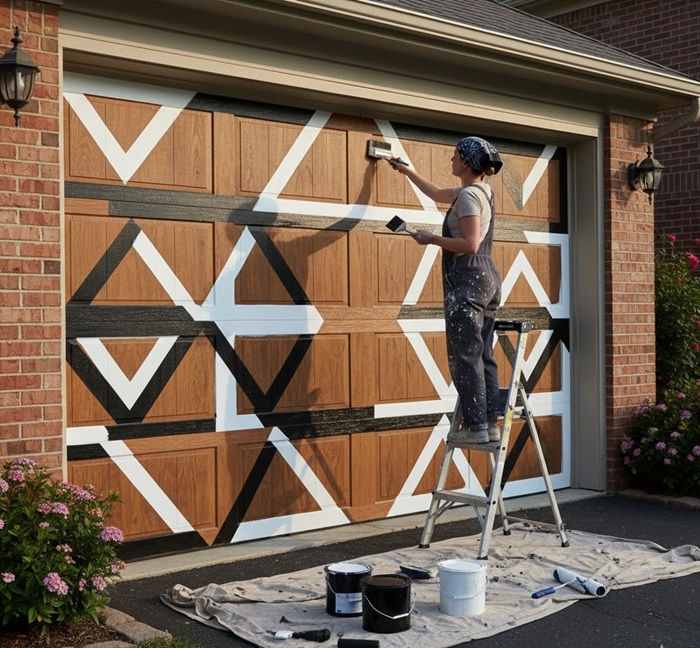
White vs. Black – Which Looks Better on a Brown Base?
When deciding between white or black for accents on a brown base, the choice depends on the style and personality you want your space to express. Both colors can look incredible when balanced correctly.
White creates a crisp, clean contrast that brightens up brown tones, especially lighter shades like tan or mocha. It highlights architectural lines and adds freshness to an exterior or garage door.
White trim or paneling on a brown base gives a welcoming, modern farmhouse vibe — ideal if you want warmth without heaviness. Opt for shades like Sherwin-Williams Pure White (SW 7005) or Alabaster (SW 7008) for a natural, balanced look that reflects light beautifully.
Black, on the other hand, delivers depth and sophistication. Against medium or dark brown, it creates a rich, dramatic aesthetic — perfect for contemporary or rustic designs.
Think of a dark espresso garage door with black hardware or trim — it adds bold character and visual weight. Try Tricorn Black (SW 6258) or Iron Ore (SW 7069) for a refined, modern edge.
Technically, both colors work; it’s about contrast and lighting. For sunny exteriors or open garages, white enhances brightness, while black offers sleek, high-end definition — both timeless, both stunning.
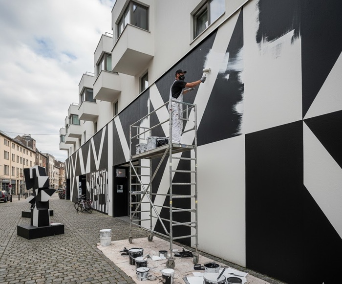
Best Sherwin Willaims White and Black Exterior Combinations
The most popular Sherwin-Williams whites and blacks combo for an exterior are all about timeless contrast and curb appeal that never fades.
Whether you’re updating a modern farmhouse or a classic brick house, this bold duo delivers architectural depth and elegance.
For whites, Alabaster (SW 7008) remains a go-to for its soft, creamy warmth that complements both brick and siding. Pure White (SW 7005) offers a cleaner, crisper appearance — perfect for a more modern exterior.
And if you want a brilliant, high-reflective finish, High Reflective White (SW 7757) gives your home a fresh, contemporary edge.
On the darker side, Tricorn Black (SW 6258) is a favorite among designers — a true, inky black that pairs beautifully with white trim or a light brick façade. Iron Ore (SW 7069) is slightly softer with gray undertones, great for a brick house aiming for subtle sophistication.
For something bolder yet balanced, Caviar (SW 6990) brings rich drama without overpowering the architecture.
Technically speaking, using satin or matte finishes outdoors enhances durability and helps resist dirt and UV fading. The contrast of bright whites and deep blacks not only defines architectural lines but also adds lasting visual harmony to any home exterior.
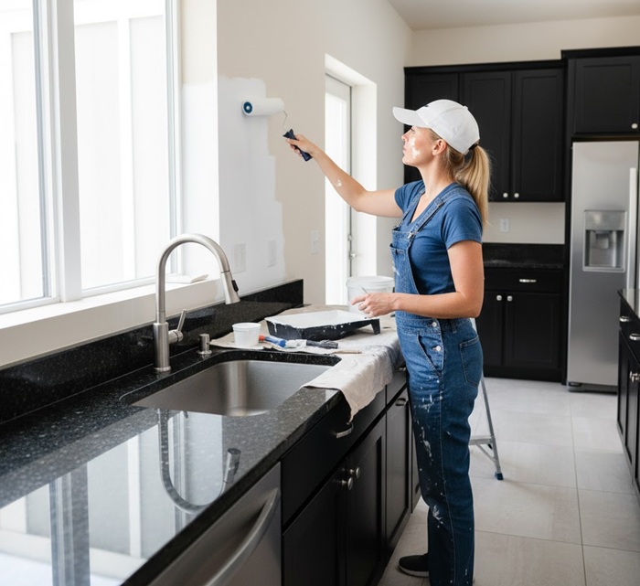
Can I Paint My Kitchen Walls White to Match Black Granite Countertops?
Yes, you can definitely paint your kitchen walls with a Sherwin-Williams white to match your black granite countertops — and when done right, the effect is stunning.
White and black are the ultimate design power couple — timeless, modern, and effortlessly elegant. The trick lies in choosing the right shade of white that complements your countertop’s undertones and lighting.
For example, Sherwin-Williams Pure White (SW 7005) is a designer favorite because it’s a neutral white with just enough warmth to soften the starkness of black granite.
If your kitchen leans toward cooler tones — say, stainless steel appliances or blue-gray cabinetry — High Reflective White (SW 7757) will give you that clean, gallery-like finish.
On the other hand, if your space gets limited natural light or you want a more inviting vibe, Alabaster (SW 7008) brings a creamy undertone that keeps the space cozy without looking yellow.
What Sherwin-Williams white tone walls go with a black ceiling?
Now, let’s talk about a bolder trend — pairing black ceilings with white walls. Yes, it’s dramatic, but when done with the right white, it looks ultra-sophisticated.
Go for High Reflective White if you want sharp contrast and a modern, high-impact look. It reflects light brilliantly, making the room feel taller and more open, even with a dark ceiling.
Alternatively, Alabaster works beautifully for those preferring a softer, warmer transition between ceiling and walls.
From a technical perspective, always use satin or semi-gloss finishes for kitchen walls — they resist moisture, stains, and grease better than matte paints.
And if your kitchen lighting relies heavily on LEDs, remember: cool LEDs can make warm whites appear yellowish, while warm LEDs can soften crisp whites.
The Bottom Line
Black and white paint colors are like chameleons, effortlessly adapting to any vision you dare to dream. Timeless and oh-so-chic, they have passed the ultimate test of endurance.
So, when it comes to choosing a color palette, don’t rush. Take a moment to discover the one that perfectly suits your needs and budget. In this article, we’ve curated a collection of Sherwin-Williams’ most popular and stylish shades, just for you.
If you’re ready to embark on the exciting journey of planning a new black and white room, let this article be your guiding light. Explore the vast spectrum of Sherwin-Williams paint options and set your creativity free.
Share the post "15+ Best Black & White Colors (by Sherwin-Williams)"

Different colors not only have an aesthetic effect, but they also can affect your mood. This means that you should Read more

Bored of the traditional wooden birdhouses? Looking for a way to spice up your garden with a splash of color? Read more

Aqua or aquamarine is a hue that rests on the color wheel somewhere between green and blue and involves a Read more

Salmon pink is a hue of pinkish-orange that is named after the color of the fish, salmon. It is neither Read more

Jack Luis is a semi-retired painter who loved painting his clients’ ideas on their walls.
He had worked as a painter for over a decade serving customers in areas such as Charleston, Mount Pleasant, Beaufort, and Georgetown, SC (South Carolina). Today in his free time, he likes to read and write about the newer techniques implemented in his profession. You may read more about him here or get in touch with him here.