

Choosing a color scheme for your home is like creating a masterpiece. It’s an art that painters and DIYers embrace to transform their spaces into havens of beauty.
A harmonious blend of colors can captivate the eye and evoke a sense of joy. But let’s admit it, we often find ourselves grappling with the daunting task of selecting the perfect palette.
Fear not! Allow me to introduce you to the most popular paint color schemes that will inspire and empower you to make a choice you’ll cherish. Let’s dive in…
Color Schemes for House Paint
For painting different rooms in your home, there are typically five different types of color schemes you can choose from. These include:
1. Monochromatic
A monochromatic scheme is a single-color scheme made using various tones of exactly one color to make bold statements in a room.
These calming and elegant color patterns (e.g., light blue, medium blue, and deep navy) are among the best for selling a house, as people often prefer mono-colored interiors when house hunting.
Though many people are told to match similar colors to one another and keep the palettes in their homes diverse, monochromatic paint jobs are eye-catching, look intentional, and stand out.
After you’ve picked a base color, you can use a color wheel to pick various hues in the same color, changing the tone and saturation of the base color to choose darker and lighter hues.
2. Analogous
This type of color scheme is made up of three different colors that sit adjacent to one another on the color wheel. For instance, yellow, orange, and orange-yellow OR blue, green-blue, and blue-violet.
You will see color schemes such as these in trendy home interiors, and it is a trend that is continuing to rise.
Even if there has been an uptick in monochrome hues, there is still a large number of homeowners who prefer color combinations such as these. They find them essential to the overall look and feel of the house, creating a more exciting appearance.
For those who enjoy a colorful setting, analogous patterns can be the perfect match. In such color schemes, one color is the dominant color, while another supports it, and a third is incorporated as an accent color.
You can control how subtle or vibrant the effect is by changing the intensity and value of the colors in the scheme.
3. Complementary
A complementary color scheme includes two colors directly across from each other on the color wheel. This type of combination offers a high-contrast look with high-impact coloring.
This color scheme’s simplicity makes it a popular one, and though it takes just two colors, there are virtually endless ways for you to mix and match them to create unique looks.
You do this by picking one dominant color and then bringing in a complementary one to accent it.
4. Triadic
In this scheme, the three shades on the color wheel located at the three points of a triangle with equal sides will make up what is called a Triadic color scheme.
It provides good contrast while retaining color harmony. (e.g., red, yellow, and blue).
Depending on the kind of color wheel you use, the hues can look quite different, which makes this just as versatile. That said, the diversity of colors that are present doesn’t promise harmony. You must select them carefully.
5. Tetradic
Finally, you have tetradic, which is four colors spaced evenly along with the color wheel.
It requires careful balancing, usually by choosing one dominant color. (e.g., blue, orange, red-violet, and yellow-green).
This scheme is quite bold if you use one as the dominant color and treat the others as accents. It takes a special eye to pull it off, but when you do, it has one of the biggest visual payouts.
| Scheme Name | Color Wheel Relationship | Basic Concept for Home Design |
| 1. Monochromatic | Uses shades, tints, and tones of a single color. | Creates a subtle, sophisticated, and cohesive look. |
| 2. Analogous | Uses two to four colors that are next to each other on the color wheel. | Offers a harmonious, serene, and comfortable feel. |
| 3. Complementary | Uses two colors that are directly opposite each other on the color wheel. | Creates a high-contrast, vibrant, and energetic look. The colors make each other stand out. |
| 4. Triadic | Uses three colors that are evenly spaced around the color wheel, forming a perfect triangle. | Offers a bold, balanced, and vibrant palette. |
| 5. Tetradic | Uses four colors arranged into two complementary pairs (forming a rectangle on the color wheel). | This is the most complex and color-rich scheme, offering maximum visual interest and variety. |

How to Choose a Color Scheme for Your Home?
Choosing a color scheme is like finding the perfect dance partner. So before you begin it’s important to think about the existing decor and furniture in your bedroom or living room.
Most rooms will have at least one dominant color and then the secondary shades that add interest and depth. It’s good to pick colors that can complement each other as accent colors or neutrals that can be blended into the overall design.
In my opinion, you should ideally start with a piece of art or fabric that steals your heart. Let the colors in the piece guide you to find their perfect matches.
You can also get fancy with a color wheel to discover the most harmonious duos. But remember, before you say “I do” to your chosen colors, make sure they pass the ultimate test on the dance floor of design.
Paint swatches are a great way to do this. Paint a large piece of poster board or construction paper and then hang it in the room to see how the colors look together.
It is also important to consider the amount of light that the room gets. A room with a lot of natural light will look different than a room with artificial light. Adjust your color scheme accordingly.
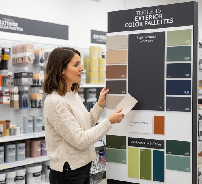
What’s the Trending Color Pallet for Exterior Walls?
Choosing an exterior color palette is one of the most impactful design decisions a homeowner can make, as it sets the tone for your entire property.
The current trend is moving away from stark white and black, embracing a balance of sophisticated neutrals and nature-inspired hues, all while expertly using the classic color schemes you mentioned.
Sophisticated neutrals and nature’s influence
The most popular trend involves using warm, deep neutrals—think smoky charcoals, rich taupes, and sophisticated sage greens—for the main body of the house. This preference often leans into the Monochromatic scheme.
Instead of one flat color, designers use varying shades and tones of the main hue: a deep slate gray body, a slightly lighter gray for the trim, and a high-contrast black or deep blue for the front door. This provides depth and elegance without overwhelming the eye.
Applying the color theory correctly for the best curb appeal
To introduce life and personality, homeowners are selectively employing bolder accents:
The Complementary Pop: The high-impact Complementary scheme is perfect for a front door or shutters.
For a home with a trendy deep blue or indigo body, an accent door in a muted, warm orange or copper-red creates a striking, welcoming focal point that utilizes this powerful contrasting relationship without being garish.
The Analogous Flow: For a more subtle, harmonious look that blends the home into its landscaping, the Analogous scheme is ideal. Consider an earthy palette: a moss green main wall, paired with soft yellow-green trim, and a deep, muted teal (blue-green) on the stucco or porch ceiling.
These colors, sitting side-by-side on the color wheel, create a serene, cohesive flow, bringing the tranquil feeling of the garden right up to the architecture.
By grounding your main walls in classic, warm neutrals and then strategically using a complementary or analogous pop of color on accents, you achieve a modern, high-end look that promises lasting curb appeal.
What Paint Colors Are Heavier and What Weighs the Least?
Remember that the color of the paint does not affect its weight. If it does, you might need to lighten your load by choosing a lighter shade.
But in all seriousness, the weight of the paint is determined by its density and pigments – not its color.
That said, some colors tend to appear heavier than others visually. For example, darker colors like black or navy blue can give off the illusion of being heavier than they actually are.
In general, the colors of the rainbow are used to express their varying weights in a number of ways.
According to the chart created by Munsell, yellow paint color is naturally lighter, while blue and red are naturally darker and also tend to be visually heavier.
What is a Split Complementary Color Scheme in Interior Design?
Much like a triadic scheme, a split-complementary color scheme is a sophisticated yet balanced three-color palette that offers more visual interest than a simple complementary scheme, while retaining strong harmony.
It’s often considered a safer and more versatile option than the classic triadic scheme.
The core mechanism of this scheme is based on finding a color’s direct opposite on the Color Wheel (the complement) and then substituting it with the two colors immediately next to the complement.
- Start with the Base Color (Key Color): Pick any color you want to dominate the scheme.
- Identify the Complement: Locate its direct opposite on the 12-step color wheel.
- Find the Split Complements: Instead of using the direct complement, use the two colors that flank it. These two colors are your split complements.
This arrangement forms a narrow, stretched “Y” or a triangle shape on the color wheel.
Using two colors adjacent to the direct complement provides a high contrast, similar to a complementary scheme, but the inclusion of two similar hues reduces the intensity and makes the overall palette feel less jarring and more nuanced.
A few other examples of split complementary color schemes include:
- Yellow, red-purple, and blue-purple
- Red, blue-green, and yellow-green
- Purple, yellow-orange, and yellow-green
The Bottom Line
The color scheme you choose during your home renovation can greatly impact the overall look of your property.
As we discussed earlier, there are numerous color schemes to consider, so take your time and experiment until you discover the perfect one that complements your space flawlessly.
And remember, if you’re not satisfied with how the colors blend together, you can always make adjustments. So enjoy the process and unleash your creativity to see what you can create.
Share the post "5 Paint Color Schemes for Your Home – What to Pick?"

Different colors not only have an aesthetic effect, but they also can affect your mood. This means that you should Read more

Bored of the traditional wooden birdhouses? Looking for a way to spice up your garden with a splash of color? Read more

Aqua or aquamarine is a hue that rests on the color wheel somewhere between green and blue and involves a Read more

Salmon pink is a hue of pinkish-orange that is named after the color of the fish, salmon. It is neither Read more

Jack Luis is a semi-retired painter who loved painting his clients’ ideas on their walls.
He had worked as a painter for over a decade serving customers in areas such as Charleston, Mount Pleasant, Beaufort, and Georgetown, SC (South Carolina). Today in his free time, he likes to read and write about the newer techniques implemented in his profession. You may read more about him here or get in touch with him here.