

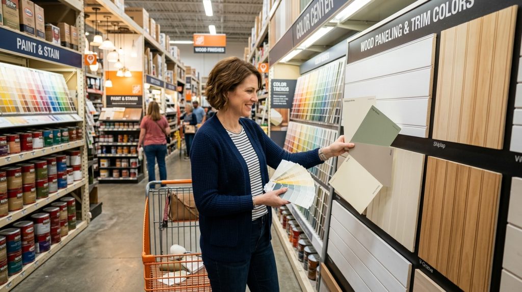
Wood paneling has a timeless charm that can transform a house into a warm and inviting home, making it a sought-after choice in recent times.
However, after installing wood panels in your home, you may feel stuck when deciding what paint colors go best with them.
Fortunately, you can choose from many options to create a welcoming ambiance in your home, and one that looks exactly as you have in mind.
However, by learning which colors go best with your specific panels and what brands to pick, you can create a gorgeous room that combines perfectly.
Wood Paneling Paint Color Ideas
A general rule for those dipping their toes into wood paneling is to use neutral and earthy colors above all else.
The best shades are thought to be yellow, white, turquoise, off-white/ivory, greens, grey, blues, and beige.
But be aware that there is much more to know when it comes to painting paneling and the best color ideas for surrounding decor. So read on to learn more if you are feeling excited with me…
1. Mustard Yellow
Yellow is surprisingly versatile when paired with wood. Because many wood species (oak, pine, walnut, and cherry) contain warm undertones, muted yellow shades naturally echo those tones.
A muted mustard or ochre can modernize dated paneling while still respecting the warmth of the wood. Brighter yellows can work as well, but they should be used carefully to avoid overwhelming the space.
For U.S. readers, popular paint choices include:
- Benjamin Moore — York Harbor Yellow
- Sherwin-Williams — Goldenrod
- Farrow & Ball — India Yellow
Used correctly, mustard tones can transform heavy wood paneling into a warm, contemporary backdrop rather than a relic of the 1970s.
2. Classic White
White remains one of the most reliable companions to wood paneling. It brightens darker spaces and creates visual contrast against the natural grain.
Interior designers often recommend soft whites rather than stark “builder-grade” whites, especially when working with warm wood tones.
Popular choices include:
- Benjamin Moore — Simply White
- Sherwin-Williams — Alabaster
- Behr — Swiss Coffee
White walls paired with light or whitewashed paneling create a clean, Scandinavian-inspired look, while pairing white walls with darker paneling can produce a modern farmhouse or coastal aesthetic.
3. Beachy Turquoise
Turquoise and wood paneling are a classic pairing in Southwestern and coastal interiors. The contrast between warm wood tones and cool turquoise hues creates a lively but balanced palette.
This color works particularly well when paired with natural materials like rattan, linen, and light oak furniture.
Consider shades such as:
- Sherwin-Williams — Reflecting Pool
- Benjamin Moore — Caribbean Blue Water
When used thoughtfully, turquoise introduces energy and personality without overpowering the natural beauty of wood.
4. Sophisticated Grays
Gray is one of the most flexible colors in interior design. It can cool down overly warm wood tones while still maintaining a refined, neutral backdrop.
Soft gray shades are particularly effective with mid-tone woods like red oak or maple, while deeper charcoal grays can look dramatic against lighter woods.
Designer favorites include:
- Benjamin Moore — Classic Gray
- Sherwin-Williams — Repose Gray
Gray works beautifully across multiple design styles — from modern and minimalist to rustic and traditional.
5. Crisp Blue
Blue is a timeless partner for wood paneling. Historically, deeper blues were often paired with mahogany, walnut, or cherry wood in libraries and formal rooms.
For a modern approach, crisp mid-tone blues provide clean contrast against vintage wood paneling, especially in homes built in the 1960s and 1970s.
Try shades like:
- Sherwin-Williams — Naval
- Benjamin Moore — Hale Navy
Add brass or gold accents in lighting or hardware to enhance the classic, slightly regal atmosphere.
6. Shades of Natural Green
Green is perhaps the most natural partner for wood because both elements evoke the outdoors.
Dark greens — such as forest, hunter, or ivy tones — create a scholarly, library-like ambiance often associated with traditional academic spaces.
Good options include:
- Benjamin Moore — Hunter Green
- Sherwin-Williams — Evergreen Fog
For a lighter and more playful look, mint, sage, or eucalyptus greens can soften heavier paneling and make a room feel brighter.
Pairing green walls with brass fixtures or warm metallic accents adds an elegant finishing touch.
7. Mild Warm Beige
Beige may not be the trendiest color in design magazines, but it remains one of the most dependable neutrals for wood-heavy spaces.
A well-chosen beige can subtly highlight the warmth of wood grain without creating harsh contrast.
Popular options include:
- Benjamin Moore — Edgecomb Gray (a greige-beige hybrid)
- Sherwin-Williams — Accessible Beige
Beige also serves as an excellent bridge color, allowing stronger accent colors like navy, emerald, or terracotta to stand out.

8. Off-white and Ivory
If you want to refresh old paneling while maintaining a classic aesthetic, off-white, cream, or ivory paints are excellent choices.
Unlike stark white, these shades contain subtle warmth that blends naturally with wood.
Designer favorites include:
- Benjamin Moore — White Dove
- Sherwin-Williams — Creamy
Ivory tones are especially effective in traditional or Tudor-style interiors, where dark wood beams or paneling are paired with lighter walls to create dramatic contrast.
However, if a room already contains many colors or strong patterns, overly light shades may feel too stark. In those cases, warmer neutrals often produce a more balanced result.
9. Deep Charcoal
For a bold, modern look, charcoal gray or near-black paint can create striking contrast with lighter wood paneling.
This approach works particularly well in home offices, media rooms, or accent walls where a dramatic atmosphere is desired.
Recommended shades include:
- Sherwin-Williams — Iron Ore
- Benjamin Moore — Wrought Iron
Charcoal tones also highlight wood texture and grain, making paneling look intentional rather than outdated.
10. Terracotta and Clay
Earthy terracotta shades are becoming increasingly popular in contemporary interiors.
These colors echo the warm red and orange undertones found in many wood stains, creating a cohesive and inviting environment.
Examples include:
- Benjamin Moore — Terra Cotta Tile
- Sherwin-Williams — Cavern Clay
When paired with wood paneling, terracotta brings a Mediterranean or desert-modern vibe that feels both grounded and stylish.
Types of Paneling That Can Be Painted
Remember that not all wall paneling is created equal, but the good news is that most interior paneling (including traditional and modern paneling styles) can be successfully painted with the right preparation like proper cleaning, light sanding, and a good bonding primer.
The key factors are the material of the panel, the surface finish, and the level of texture or grooves.
One of the most common paint-friendly styles is wainscoting, a decorative wall treatment that typically covers the lower third of a wall and is often finished with a chair rail.
Because wainscoting is usually made from wood or MDF with a relatively smooth surface, it takes paint very well.
Another popular option is shiplap, which consists of horizontal boards with small overlapping joints. Originally used in barns and coastal homes, shiplap has become a staple in modern farmhouse and contemporary interiors.
Its simple, linear structure makes it easy to paint, and lighter shades like white, soft gray, or sage green can highlight the clean lines between boards.
Beadboard is another paint-friendly paneling style. Identified by its narrow vertical planks and distinctive grooves (or “beads”), beadboard adds a classic cottage or traditional feel and is often used in kitchens, bathrooms, and hallways.
In addition to these decorative paneling styles, plywood paneling can also be painted successfully. Often used as a cost-effective wall covering, plywood panels may come with a veneer or laminated finish.
Picking the Right Paint Colors for Wood Paneling
Choosing paint colors for wood-paneled walls is a bit like pairing wine with food: the right match enhances everything, while the wrong one makes both feel off.
Wood paneling already carries tone, texture, and natural variation, so the goal is not to overpower it but to work with it.
Here are seven practical, design-savvy tips to help you choose the right paint colors for wood panels.
1. Start with the wood’s undertone
Before selecting paint, study the undertone of the wood. Most wood species fall into one of three tone families:
- Warm tones – cherry, mahogany, red oak
- Neutral tones – walnut, white oak
- Cool tones – ash, birch, some maples
Paint colors should either harmonize with these undertones or intentionally contrast them.
For example, warm woods often pair well with creamy whites, soft beiges, and olive greens, while cooler woods handle blues and charcoal grays more gracefully.
2. Match the color strategy to light vs. dark paneling
Not all wood paneling behaves the same.
- Dark paneling (cherry, walnut, mahogany) benefits from lighter surrounding colors such as warm white, ivory, or light gray to prevent the room from feeling heavy.
- Light woods (maple, birch, ash) can comfortably handle deeper accent colors like navy, forest green, or charcoal.
This contrast helps maintain visual balance while allowing the wood grain to remain the star of the show.
3. Let furnishings and fabrics do some of the work
Paint isn’t the only element shaping the room’s palette. Textiles, rugs, upholstery, and curtains can dramatically enhance the tone of wood paneling.
For instance:
- Linen and cotton fabrics soften darker woods.
- Leather, velvet, or wool textures amplify rich wood tones.
- Neutral upholstery allows wood grain patterns to stand out.
Think of these elements as supporting actors that help the wood paneling perform at its best.
4. Use color theory as a guide—not a rulebook
The sweet spot in interior design usually sits somewhere between color theory and personal preference.
A practical approach is to evaluate the value (lightness or darkness) of the wood first. Then select paint colors that either:
- Complement it (similar warmth or tone), or
- Contrast it (lighter or darker for visual definition)
For example, maple paneling in a bright room might pair beautifully with deep green or navy, while darker cherry paneling may benefit from cream or greige tones.
5. Warm neutrals are almost always safe
Warm neutrals remain one of the most reliable companions to wood paneling.
Shades like warm beige, greige, taupe, and soft tan highlight the rich brown undertones of wood without creating harsh contrast. This approach produces a room that feels cohesive, comfortable, and timeless rather than trendy.
Interior designers often lean on these tones when working with heavily paneled rooms such as dens, libraries, or living rooms.
6. Use contrast strategically
Contrast is a powerful design tool—but it works best when applied intentionally.
- Dark paneling pairs well with lighter paints like white, ivory, pale gray, or soft blue to open up the space.
- Light paneling can handle richer colors such as navy, emerald green, charcoal, or deep teal.
You can also introduce darker accents—like black hardware, espresso furniture, darker crown moldings, or dark coffee-toned decor—to create layered depth without overwhelming the room.
7. Choose the right paint type and finish
Color is only half the equation. Paint type and sheen also influence the final result.
For wood-paneled walls, professionals often recommend:
- High-quality interior latex or acrylic paint
- Satin or eggshell finish
These finishes strike a good balance between durability and subtle sheen, making them easier to clean while still looking refined.
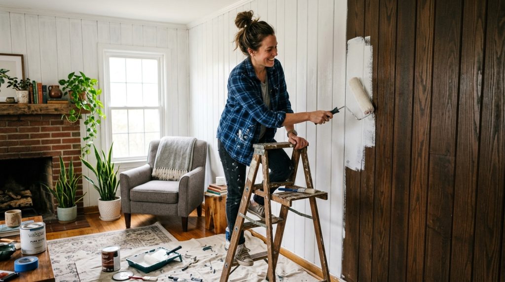
Techniques to Use for Painting and Maintaining Paneling
Painting wall paneling successfully is less about the brush and more about proper surface preparation and the right technique.
Paneling typically includes grooves, seams, and visible wood grain, all of which influence how paint adheres and how smooth the final finish appears.
Before deciding on the colors that complement wood paneling,
- Start by cleaning the surface thoroughly. A mild degreaser or trisodium phosphate (TSP) solution helps remove dust, oils, and residue that could prevent paint from bonding properly.
- After cleaning, lightly sand the paneling to reduce gloss and create a slightly rough surface that improves paint adhesion. This step is particularly important when dealing with older finishes or varnished surfaces.
- Applying a high-quality bonding primer is also essential, as it seals the wood and creates a stable base for the topcoat.
- Apply thin, even coats – using a brush for grooves and a roller for flat sections helps achieve a uniform finish.
- And allow proper drying time between coats to avoid streaks or uneven texture.
When selecting paint, consider how the shade interacts with the natural tone of the wood.
The best paint goes with wood paneling when it either complements the existing warmth of the wood or creates an intentional contrast.
Lighter neutrals and soft grays often balance dark wood paneling, while deeper tones like navy or forest green can enhance lighter wood surfaces.
Choosing thoughtful wood panel colors ensures that the paneling works harmoniously with the rest of the room.
When designing the overall palette, also think about colours that match a wood-paneled room, including trim, furniture, wooden accent chairs, and lighting, so the painted surfaces blend naturally with the décor.
Maintenance is equally important after the painting process. To maintain painted paneling:
- Dust the grooves regularly with a microfiber cloth or soft brush.
- Use mild cleaners rather than abrasive scrubbing pads to protect the paint finish.
- Touch up small chips or scratches early to keep the surface looking fresh and consistent.
With the right preparation, painting method, and maintenance routine, paneling can remain attractive and durable for many years while enhancing the overall character of the room.
Related FAQs
Can I paint over stained wood paneling?
Yes, you can paint over stained wood paneling, but proper preparation is essential for a durable finish.
Start by cleaning the surface to remove dust and oils, then lightly sand the paneling to reduce the glossy stain layer.
Apply a high-quality bonding primer to seal the tinted stain and prevent bleed-through. Once primed, you can apply two thin coats of interior paint for a smooth, long-lasting result.
What is the best color to paint dark wood paneling?
The best colors for dark wood paneling are usually light neutrals or soft contrasts that balance the heaviness of the wood.
Shades like warm white, cream, light gray, greige, or soft sage help brighten the room while complementing the wood’s undertones.
If you prefer a bold look, deep navy or forest green can also pair beautifully with dark paneling and create a sophisticated, modern feel.
How long does it take for paint to dry on dark wood paneling?
Paint drying time depends on the paint type, humidity, and ventilation. Most interior latex paints become touch-dry within 1–2 hours, but it’s best to wait about 4 hours before applying a second coat.
Complete curing can take 24–48 hours or longer. Because wood paneling often has grooves and grain texture, allowing adequate drying time helps ensure even coverage and prevents smudging.
What are the best paint colors that go with wood paneling in a bathroom?
Bathrooms and powder rooms with wood paneling benefit from colors that feel light, fresh, and moisture-friendly.
Soft whites, pale gray, light sage green, and muted blue are popular choices because they brighten the space while complementing natural wood tones.
Coastal-inspired shades like aqua or seafoam can also work well. Pair these colors with moisture-resistant paint finishes such as satin or semi-gloss for durability.
The bottom line
Planning to redo your 70’s wood paneling to make them look nicer? Well, there are endless options you can try to get the makeover done beautifully.
With the right paint colors, preparation techniques, and finishing touches, it can become one of the most visually appealing features in a room.
The key is to consider the tone of the wood, the lighting in the space, and the overall design style before choosing your paint palette.
Lighter neutrals can brighten darker paneling, while deeper shades can add contrast and sophistication to lighter woods.
Most importantly, proper cleaning, priming, and painting techniques ensure that the finish looks smooth and lasts for years.
With a thoughtful approach, wood paneling can easily transform from a dated wall covering into a warm, stylish design element that enhances the entire space.
Share the post "10 Paint Colors that Complement Wood Paneling"

Different colors not only have an aesthetic effect, but they also can affect your mood. This means that you should Read more

Bored of the traditional wooden birdhouses? Looking for a way to spice up your garden with a splash of color? Read more

Aqua or aquamarine is a hue that rests on the color wheel somewhere between green and blue and involves a Read more

Salmon pink is a hue of pinkish-orange that is named after the color of the fish, salmon. It is neither Read more

Jack Luis is a semi-retired painter who loved painting his clients’ ideas on their walls.
He had worked as a painter for over a decade serving customers in areas such as Charleston, Mount Pleasant, Beaufort, and Georgetown, SC (South Carolina). Today in his free time, he likes to read and write about the newer techniques implemented in his profession. You may read more about him here or get in touch with him here.